
Every developer has been there: rushing into code because the idea feels fresh, exciting, and “obvious.”
Fast-forward a few days, and suddenly you’re knee-deep in spaghetti logic, fighting fires that could’ve been avoided with a little upfront planning.
It’s not glamorous, it’s not the part you brag about but it’s the difference between shipping confidently and endlessly patching things you half-understand.
This blog isn’t here to sell you on complex frameworks or shiny productivity hacks.
It’s here to give you the kind of honest, practical perspective developers actually need.
We’ll talk about the planning mistakes everyone makes, the habits that save you from painful rework, and why the boring stuff at the start pays off when deadlines start breathing down your neck.
Because here’s the truth: planning isn’t a waste of time, it’s the insurance policy that keeps you sane when the code gets messy.
The Uncomfortable Truth About Planning
Core Truths
- TRUTH 1: You know that sinking feeling when your code doesn’t work and you have no idea why? That’s what happens when you skip planning.
- TRUTH 2: Every time you say “I’ll just wing it,” a developer somewhere cries into their energy drink.
- TRUTH 3: The apps you use every day weren’t built by developers who “figured it out as they went.” They were planned. Even TikTok had a plan (probably written on a napkin, but still a plan).
- TRUTH 4: Planning doesn’t make you slow. Not planning makes you debug for 6 hours straight wondering why your button doesn’t work.
The Bottom Line: Planning is like brushing your teeth. You can skip it, but the consequences are ugly and everyone will notice.
Frontend Planning Fails (And How to Not Fail)
1. The Great Button Disaster of 2025
What they asked for: “Just add a delete button”
What I thought: “Easy! One button, one click, done.”
My brilliant implementation:
<button onclick="deleteEverything()">Delete</button>
The catastrophic results:
- User clicked delete
- Entire user account vanished
- No confirmation dialog
- No undo option
- User’s 5 years of data: GONE
- User’s emotional state: NUCLEAR
- My job security: QUESTIONABLE
What I Should Have Planned
The proper delete flow:
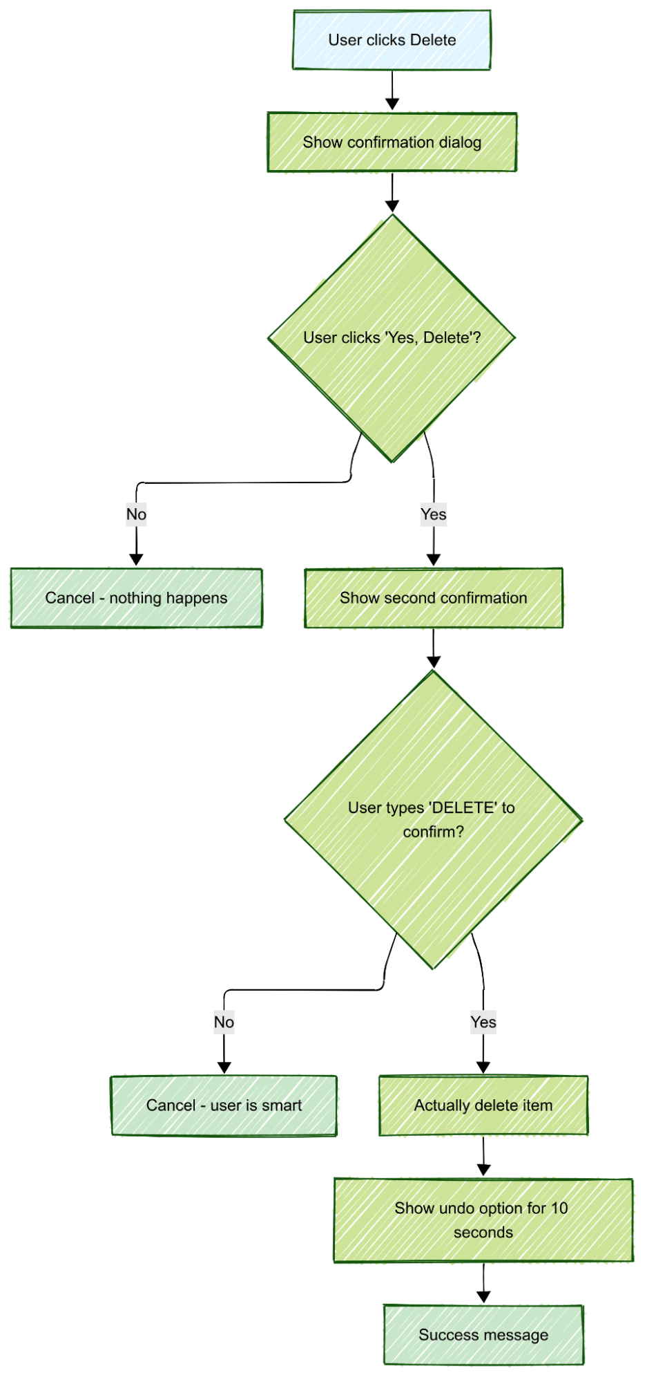
The lesson: When dealing with destruction, assume users are tired, distracted, and have cats walking on their keyboards.
2. The Modal From Hell
What they asked for: “Show user details in a popup”
What I thought: “Modals are easy, just slap some CSS on it.”
My “brilliant” solution:
 <style>
.modal {
  position: fixed;
  top: 50%;
  left: 50%;
  background: white;
}
</style>
User experience nightmare:
- Modal appears off-screen on mobile
- Can’t scroll to see the close button
- No way to close it with keyboard
- Traps users forever in modal prison
- Background content still scrollable
- Modal shows behind header navigation
- Users start questioning their life choices
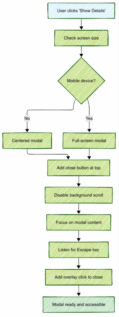
What I Should Have Planned
Modal planning considerations:
- Screen size compatibility: What happens on a tiny screen?
- Keyboard accessibility: How do keyboard users close this?
- Content overflow: What if the content is taller than the screen?
- Accidental dismissal: Can users accidentally click outside and lose their work?
The proper modal flow:
3. The Form That Ate User’s Souls
What they asked for: “Create a registration form”
My lazy approach:
 <form>
  <input type="text" placeholder="Email">
  <input type="password" placeholder="Password">
  <button type="submit">Register</button>
</form>
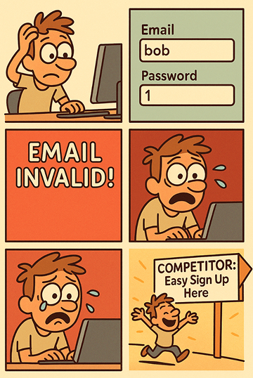
User experience horror story:
- User types “bob” in email field → No feedback
- Password field accepts “1” as valid → No validation
- Form submits → Server says “email invalid” → Form clears everything
- User tries again → Same disaster
- User gives up → Signs up with competitor
- My conversion rate: 📉
What I Should Have Planned
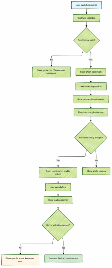
Form planning questions:
- What if the user makes a typo?
- How do they know what went wrong?
- Should we lose their data when something fails?
- What feedback do they need while typing?
The proper form flow:
Backend Planning Disasters (With Happy Endings)
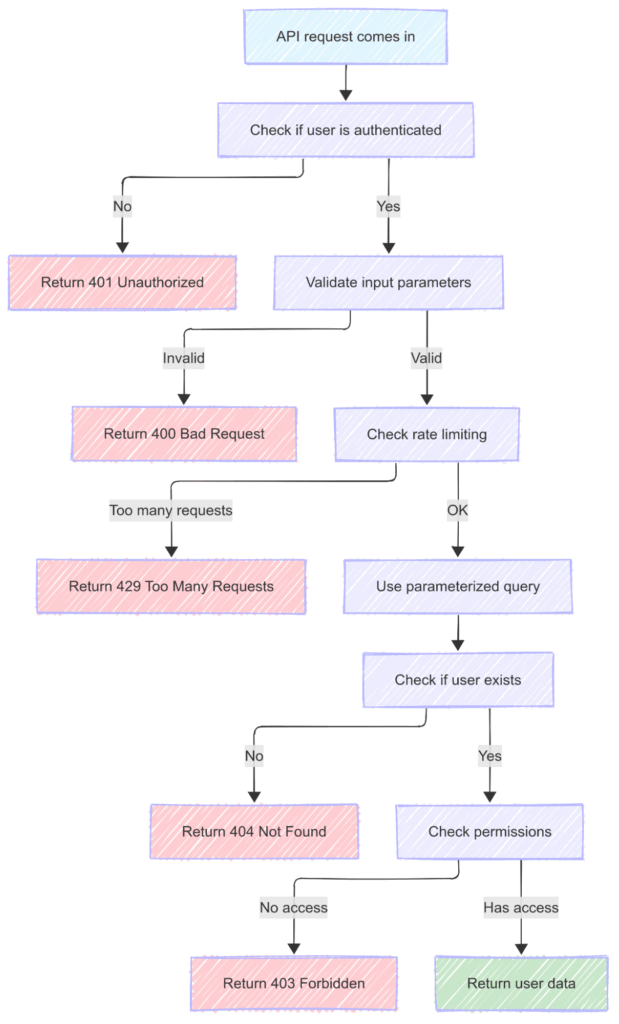
1. The API That Brought Down The Internet
What they asked for: “Create an endpoint to get user data”
My genius plan: None. Just code it and ship it. What could go wrong?
My masterpiece:
 app.get('/api/user/:id', (req, res) => {
  const user = db.query(`SELECT * FROM users WHERE id = ${req.params.id}`);
  res.json(user);
});
What happened:
- Someone called /api/user/1; DELETE FROM users;–
- My database: OBLITERATED 💀
- The SQL injection worked perfectly: SELECT * FROM users WHERE id = 1; DELETE FROM users;–
- My backup strategy: WHAT BACKUP? 🤷♂️
- My error handling: WHAT ERROR HANDLING? 🔥
- My career prospects: DECLINED 📉
- My sleep schedule: DESTROYED 😴💔
- My manager’s reaction: LEGENDARY 😡
The lesson:
app.get('/api/user/:id', (req, res) => { const user = db.query('SELECT * FROM users WHERE id = ?', [req.params.id]); res.json(user); });
Always use parameterized queries, kids:
Recovery time:
3 days, 2 energy drinks, 1 very awkward meeting with legal
This story is dedicated to every developer who learned about SQL injection the hard way
What I Should Have Planned
Security planning questions I ignored:
- Who’s allowed to access this data?
- What if someone sends malicious input?
- How many requests per minute is reasonable?
- What happens if the database is slow?
- What errors could happen and how should I respond?
The proper API flow:
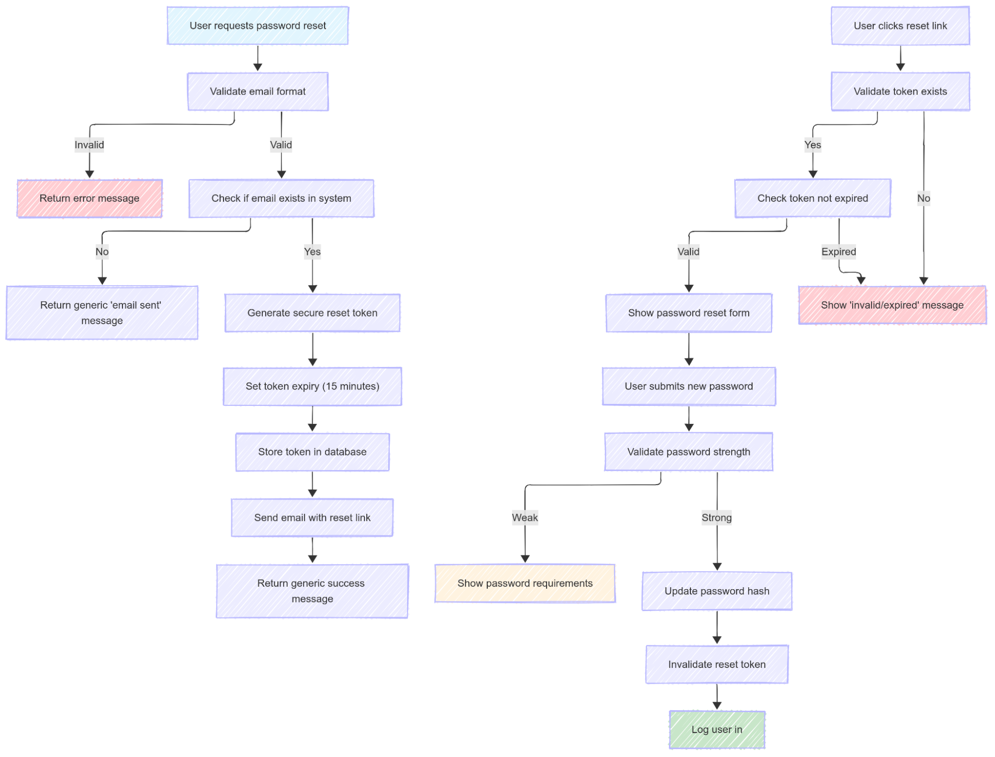
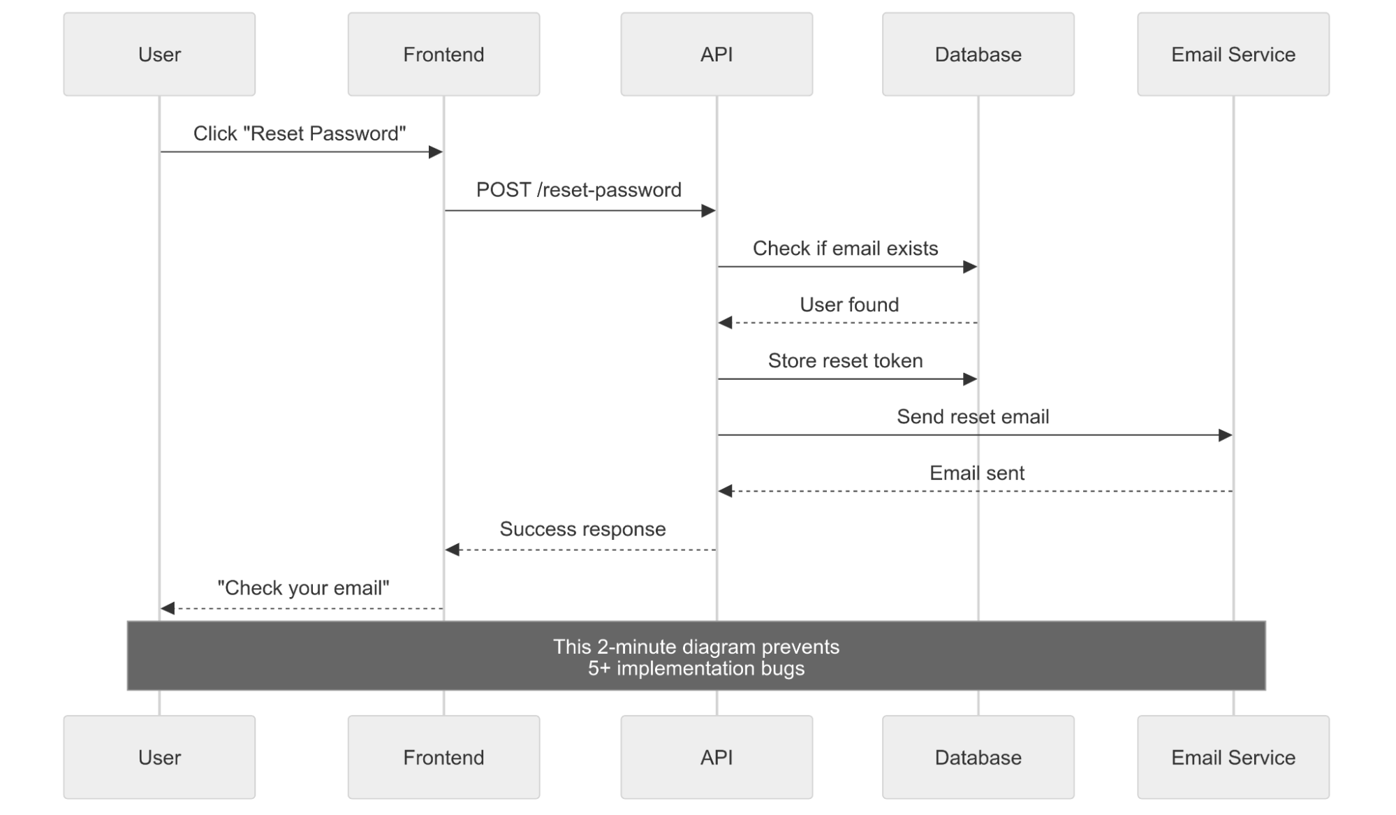
2. The Password Reset Nightmare
What they asked for: “Users need to reset forgotten passwords”
My brilliant solution:
 app.post('/reset-password', (req, res) => {
  const newPassword = Math.random().toString();
  // Update user password
  // Email new password to user
  res.json({ message: 'New password sent!' });
});
Security catastrophe:
- New password: “0.7834592847” (super secure!)
- Sent via unencrypted email
- No verification of who’s requesting reset
- Anyone can reset anyone’s password
- Security team finds out
- Security team has mental breakdown
- I learn what “PCI compliance” means the hard way
What I Should Have Planned
Security questions I should have asked:
- How do we verify this is really the user?
- What if someone else has access to their email?
- How long should reset links be valid?
- Should we tell attackers if an email exists?
- What happens if they don’t use the reset link?
The proper password reset flow:
3. The Database Schema Catastrophe
What they asked for: “Store user posts and comments”
My genius database design:
 CREATE TABLE everything (
  id INT,
  data TEXT,
  stuff VARCHAR(5000),
  more_stuff TEXT
);
What this “design” created:
- User data mixed with post data mixed with comment data
- Finding a user’s posts required scanning the entire table
- Deleting a user meant finding all their scattered data
- Comments had no connection to posts
- Foreign keys? Never heard of them
- Database queries took 45 seconds
- Junior developer cried looking at my schema
What I Should Have Planned
Planning questions that would have saved my sanity:
- What are the main “things” in my system? (Users, Posts, Comments)
- How do these things relate to each other?
- What will I need to query frequently?
- How do I prevent duplicate data?
- What happens when I need to delete a user?
The proper database design:
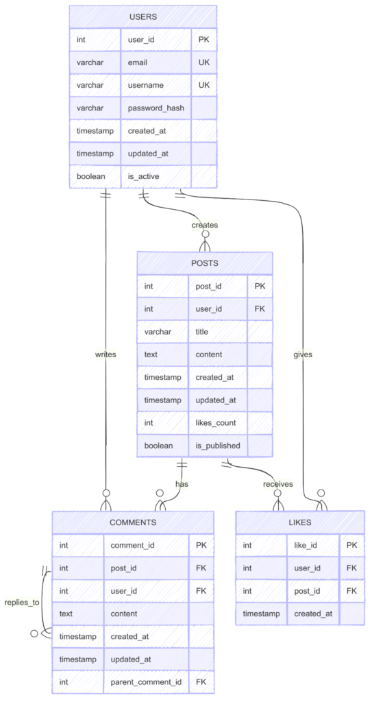
The lesson: Throwing everything into one table is like putting all your clothes, food, and electronics in one giant box. Good luck finding anything!
Component Design Disasters
1. The Copy-Paste Component Apocalypse (Frontend)
What they asked for: “Add buttons throughout the app”
My brilliant strategy: Copy-paste the same button code everywhere.
My “reusable” approach:
<!-- Login page -->
<button class="blue-button-login" onclick="loginUser()">Login</button>

<!-- Profile page -->
<button class="blue-button-profile" onclick="saveProfile()">Save Profile</button>

<!-- Settings page -->
<button class="blue-btn-settings" onclick="updateSettings()">Update Settings</button>

<!-- Delete page -->
<button class="red-button-delete-user" onclick="deleteUser()">Delete Account</button>
What happened when they asked to change button styling:
- Had to update 47 different CSS classes
- Missed 12 buttons that stayed the old style
- Spent 3 days hunting down all button variations
- Each page had slightly different hover effects
- Accessibility attributes missing on half of them
- Color scheme update became a 2-week project
What I Should Have Planned (Component-Based Thinking)
The planned component approach:
 // One button to rule them all
function Button({ text, variant = 'primary', size = 'medium', disabled, loading, onClick }) {
  return (
    <button
      className={`btn btn-${variant} btn-${size}`}
      disabled={disabled || loading}
      onClick={onClick}
      aria-busy={loading}
    >
      {loading ? <Spinner /> : text}
    </button>
  );
}
// Usage everywhere:
<Button text="Login" variant="primary" onClick={handleLogin} />
<Button text="Delete Account" variant="danger" onClick={handleDelete} />
<Button text="Save Profile" loading={isSaving} onClick={handleSave} />
Component structure:
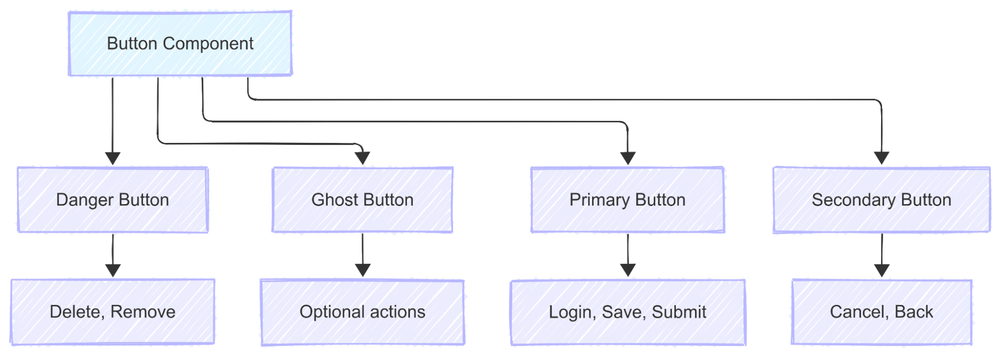
The lesson: Copy-paste is not a design pattern. It’s a future maintenance nightmare.
2. The Monolithic Component Monster (Frontend)
What they asked for: “Create a user profile page”
My approach: One giant component to handle everything.
My 500-line monster problems:
- 50+ different state variables
- Functions for everything mixed together
- 300+ lines of JSX horror
- Impossible to test individual features
- Changing avatar upload broke friend requests somehow
- New developer takes 2 hours to understand one component
- Hot reloading takes 10 seconds
- Git conflicts on every merge
What I Should Have Planned (Modular Thinking)
Component breakdown:
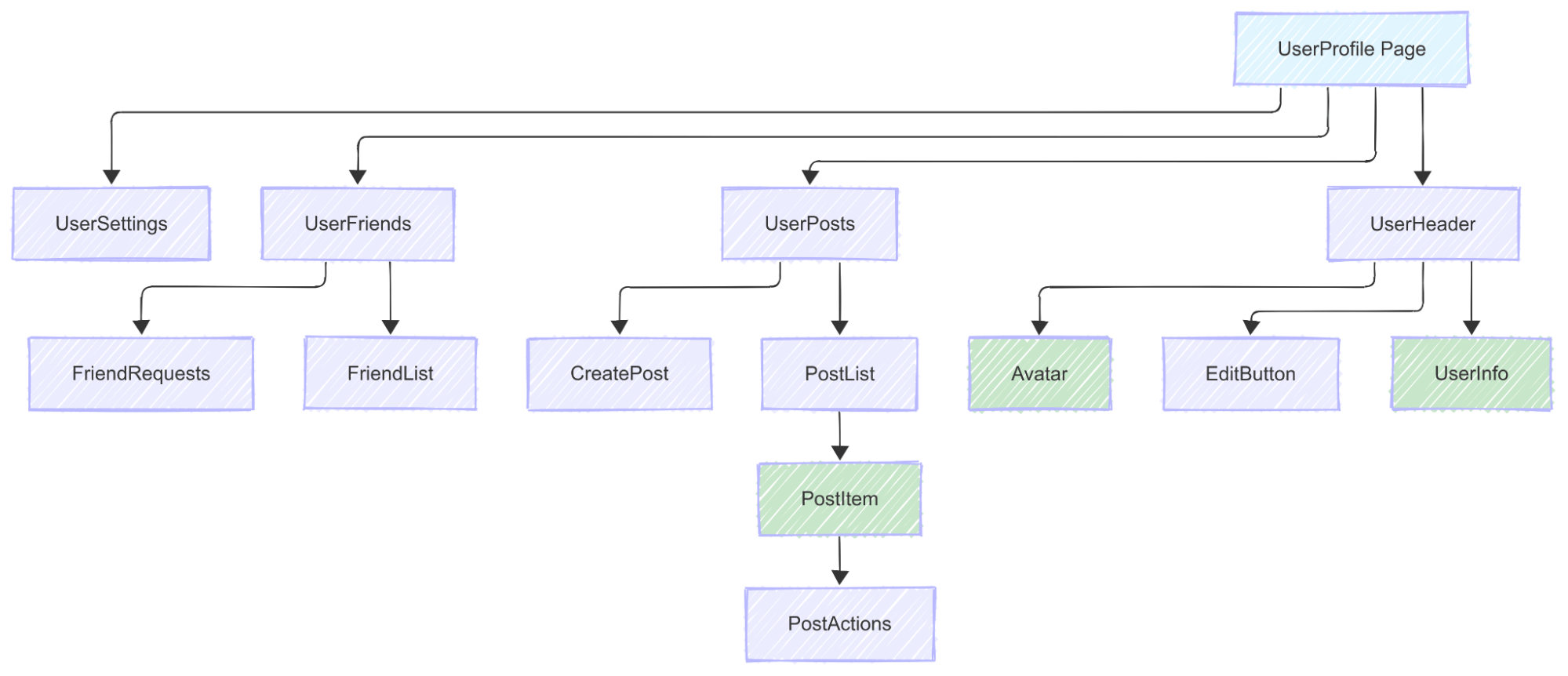
The lesson: Big components are like big functions – they do too much and break when you look at them wrong.
3. The Backend Service Spaghetti (Backend)
What they asked for: “Handle user registration with email verification”
My “everything in one place” disaster:
- One endpoint doing 6 different jobs
- Testing requires mocking everything
- Email template changes require touching registration logic
- Password validation scattered across multiple endpoints
- Impossible to reuse email verification for other features
- Bug in email sending breaks user creation
What I Should Have Planned (Service-Based Architecture)
Service breakdown:
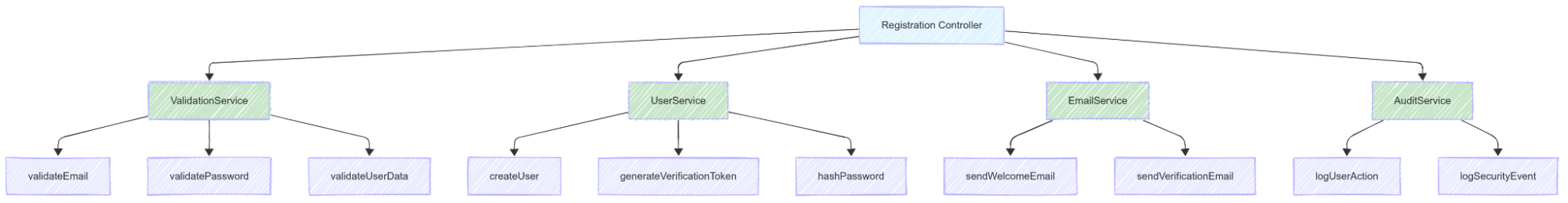
The lesson: One function doing everything is like a Swiss Army knife trying to be a toolbox. It’s messy and nothing works properly.
Problem-Solving Approaches That Actually Work
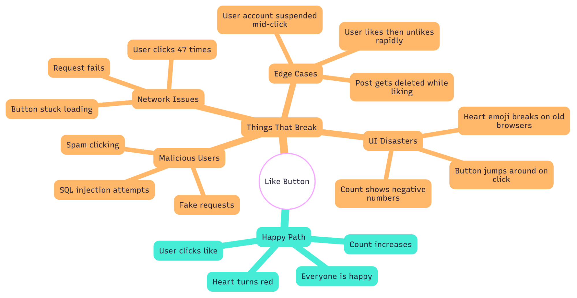
1. The “What Could Possibly Go Wrong?” Method
This is perfect for naturally pessimistic developers who expect everything to break.
- Step 1: Think of your feature working perfectly
- Step 2: Now imagine you’re a malicious user with nothing to lose
- Step 3: List every way you could break it
- Step 4: Plan defenses for each attack
Example: Building a “Like” button
2. The “Rubber Duck Planning” Method
Explain your plan to a rubber duck (or confused intern). If you can’t explain it simply, your plan is too complicated.
Frontend Duck Session:
- “So Duck, when the user clicks this button…”
- “It should show a loading spinner…”
- “Wait, what if they click it twice while loading?”
- “Uh Oh, I need to disable the button!”
- “And what if the request fails?”
- “I need an error state too!”
Backend Duck Session:
- “Duck, this endpoint receives user ID…”
- “It fetches their data from the database…”
- “But what if the ID is invalid?”
- “Or what if they’re trying to access someone else’s data?”
- “I need authentication and authorization!”
3. The “Walking Through the Disaster” Method
Literally walk through your app like a user who’s having the worst day of their life.
The Disaster User Profile:
- Phone battery at 2%
- Using public WiFi that cuts out every 30 seconds
- Has fat fingers and clicks wrong things
- In a hurry and impatient
- Easily distracted by notifications
- Expects everything to work instantly
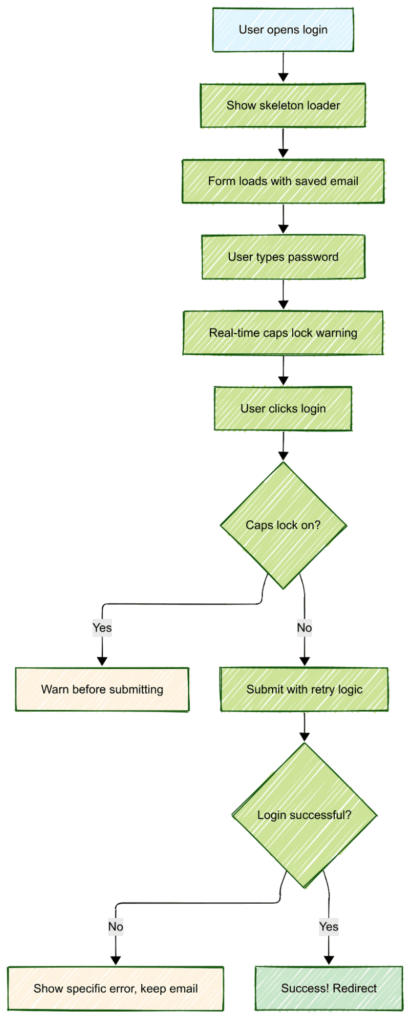
Walking Through Login Disaster:
- User opens app on slow connection
- Login form takes 10 seconds to load
- User types email, auto-correct changes it
- User doesn’t notice, clicks login
- Error: “Invalid email”
- Form clears password field
- User gets frustrated, tries again
- Caps lock is on, password fails
- Account gets locked after 3 attempts
- User throws phone at wall
Planning Response:
4. The “Grandma Test” Method
If your grandma can’t figure out your interface, it’s too complicated.
Frontend Grandma Questions:
- “Where do I click to do the thing?”
- “Why did that button disappear?”
- “What does this error message mean?”
- “How do I undo what I just did?”
- “Is it working or is it broken?”
Backend Grandma Questions (if she was technical):
- “Why does this take so long?”
- “Why did my data disappear?”
- “Why can’t I access my account?”
- “Why do I have to sign in again?”
Visual Planning for People Who Hate Planning
1. The “Sticky Note Method”
Write each step of your feature on a sticky note. Rearrange until it makes sense.
Example: User Registration Flow
 [User arrives] → [Shows signup form] → [User fills form]
     ↓                    ↓                    ↓
[Clicks submit] → [Validation fails] → [Shows errors]
     ↓                    ↓                    ↓
[Success!] → [Sends welcome email] → [Redirects to app]
Rule: If you need more than 20 sticky notes, your feature is too complex. Break it down.
2. The “Comic Strip Method”
Draw your user flow like a comic strip. Each panel is a step.
The Shopping Cart Comic Strip:
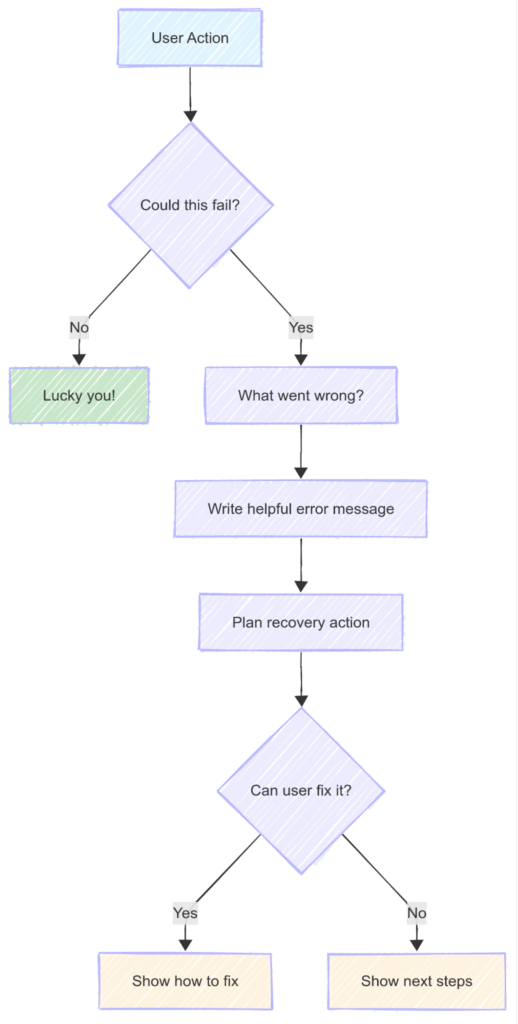
3. The “Error Message Planning” Method
Plan your error messages first. If you can’t write a helpful error message, your feature is confusing.
Bad Error Messages I’ve Written:
- “Error 500: Something went wrong”
- “Invalid input”
- “Failed”
- “No”
Good Error Messages I Should Have Written:
- “Your password needs at least 8 characters and one number”
- “This email is already registered. Try signing in instead?”
- “File too large. Please choose an image under 5MB”
- “Network connection lost. We’ll retry automatically”
Error Message Planning Flow:
The “Uh Oh” Prevention Kit
1. Frontend “Uh Oh” Moments and Prevention
“Uh Oh, it doesn’t work on mobile!”
The Problem:

The Solution:

Prevention: Open Chrome dev tools, set to mobile view, design there first.
“Uh Oh, users can’t figure out how to use this!”
Prevention Questions:
- What’s the most obvious thing a user would try first?
- If I removed all text labels, would it still make sense?
- What would happen if a colorblind user tried this?
- Can someone use this with only a keyboard?
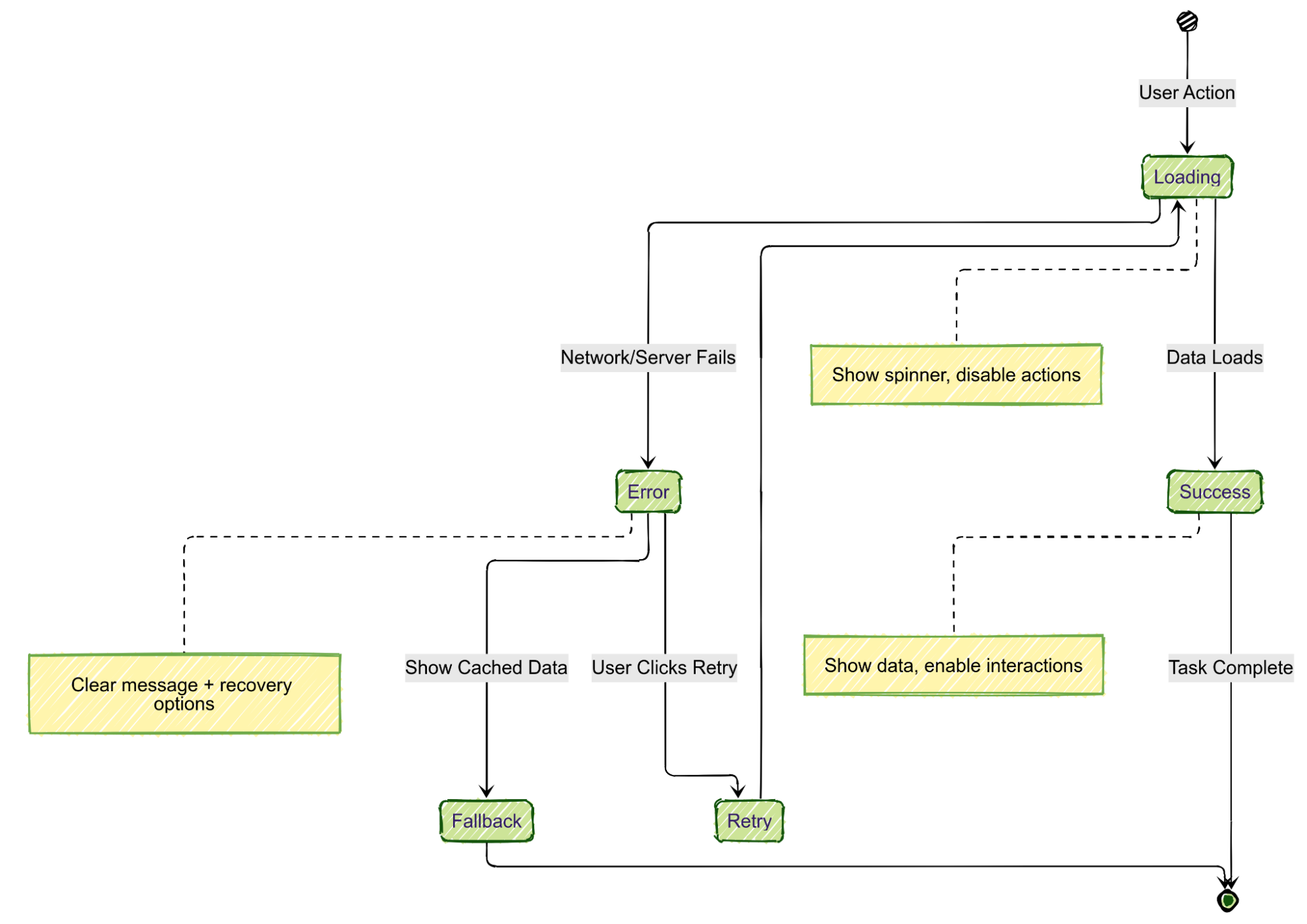
“Uh Oh, the loading spinner spins forever!”
Loading State Planning:
2. Backend “Uh Oh” Moments and Prevention
“Uh Oh, the database is on fire!”
Prevention: Plan for failure from day one.
Failure Planning:
“Uh Oh, someone is trying to hack us!”
Prevention Questions:
- What’s the worst input someone could send?
- How many requests per second is suspicious?
- What data should never be returned in API responses?
- What happens if someone guesses a valid ID?
“Uh Oh, the server costs are $10,000 this month!”
Prevention: Think about efficiency before you have a problem.
Cost Optimization Planning:
- Add caching → 95% fewer database calls
- Add database indexes → Queries 100x faster
- Paginate results → Fixed response size
- Use CDN for static files → Faster global delivery
Quick Planning Checklists
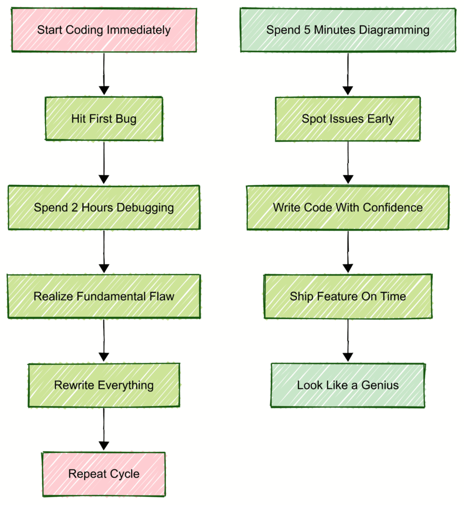
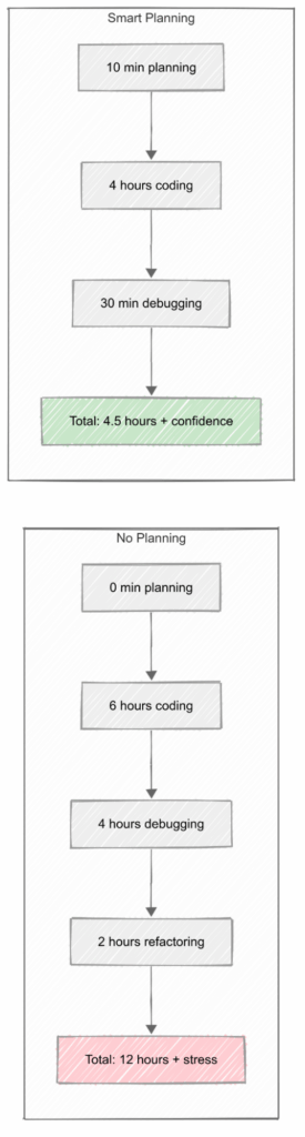
The Planning Paradox: The less time you think you have to plan, the more time you’ll waste fixing what you didn’t plan for. Five minutes of thinking can save you five hours of debugging.
The Power of Visual Thinking
Why diagrams save your sanity:
- Your brain processes visuals 60,000x faster than text
- Diagrams expose gaps in your logic before code does
- Team members understand flowcharts better than your brilliant variable names
- You can spot stupid mistakes in diagrams that hide in code
1. Frontend Feature Checklist
Before you write any code – THINK AND DIAGRAM:
User Experience Planning (2-3 minutes)
- What does the user see first? → Sketch the initial state
- What happens when they click/tap things? → Draw the interaction flow
- How does this look on a tiny phone screen? → Wireframe mobile layout
- What would confuse users the most? → Circle potential confusion points
Technical Reality Check (2-3 minutes)
- What if the internet is slow? → Plan loading states
- What if something breaks? → Design error states
- Can someone use this without a mouse? → Map keyboard navigation
What happens on older browsers? → List fallback behaviors
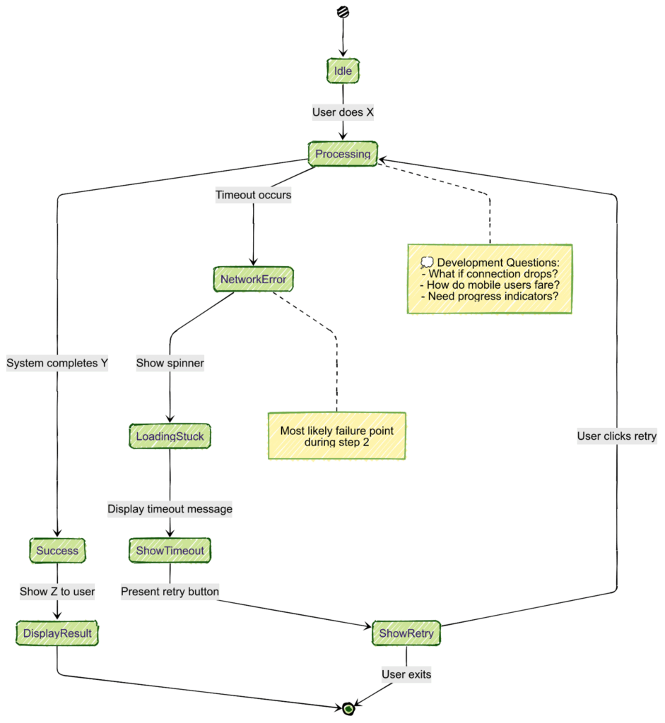
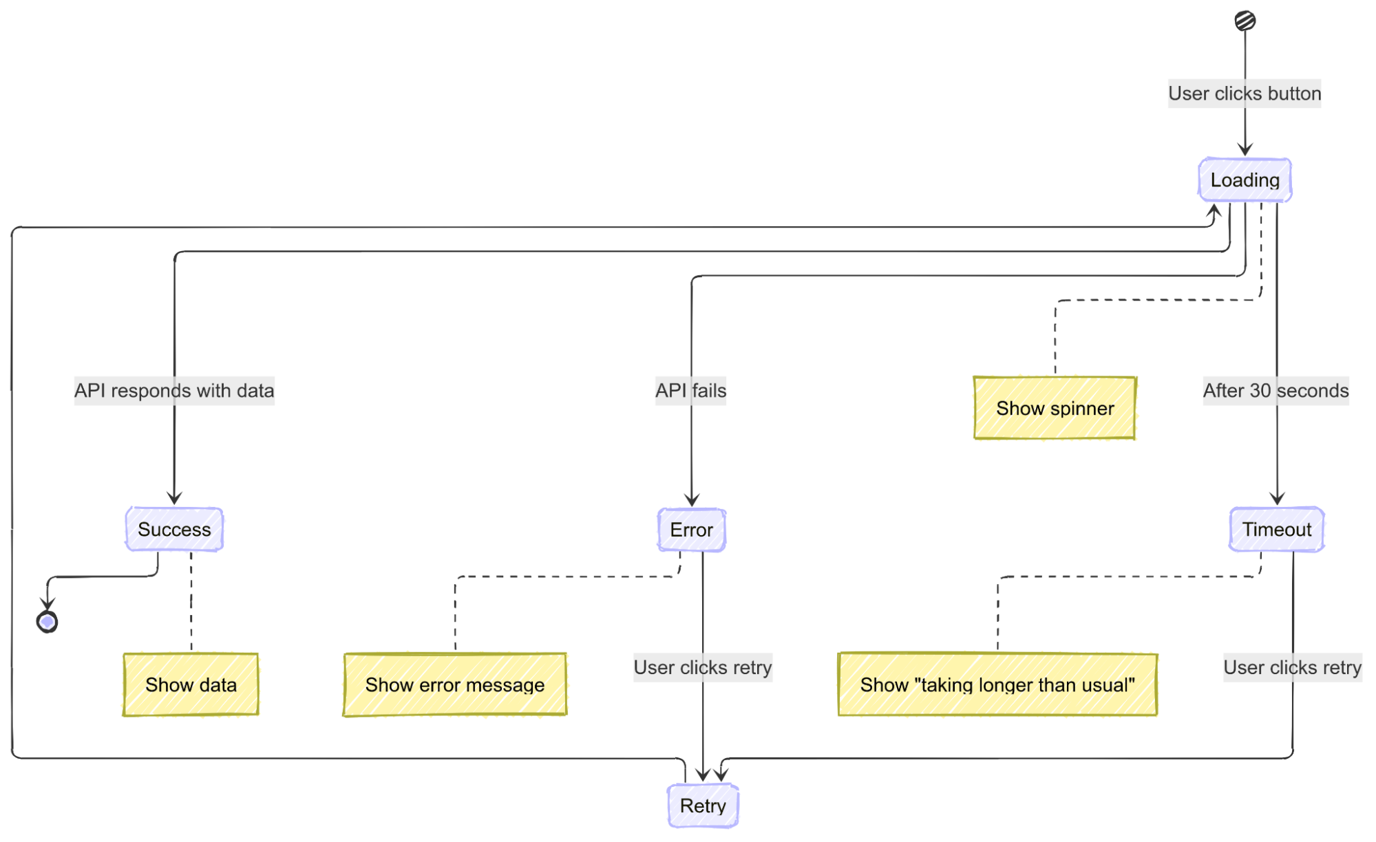
Planning Technique: Create a simple state diagram showing: Loading → Success → Error → Recovery
2. Backend Feature Checklist
Before you create any endpoints – THINK AND DIAGRAM:
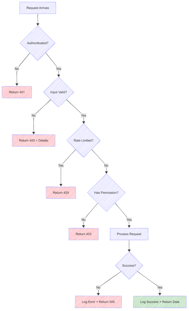
Security & Access Planning (3-4 minutes)
- Who’s allowed to use this? → Draw authentication flow
- What input do I expect? → List and validate all parameters
- What could someone send to break this? → Brainstorm attack vectors
- What data should never be returned? → Mark sensitive fields
Performance & Reliability Planning (2-3 minutes)
- How fast should this respond? → Set performance targets
- What happens when it fails? → Design graceful degradation
- What data should I log? → Plan audit trail
How will I test this? → Write test scenarios before code
Planning Technique: Create a security flow diagram showing request validation at each step
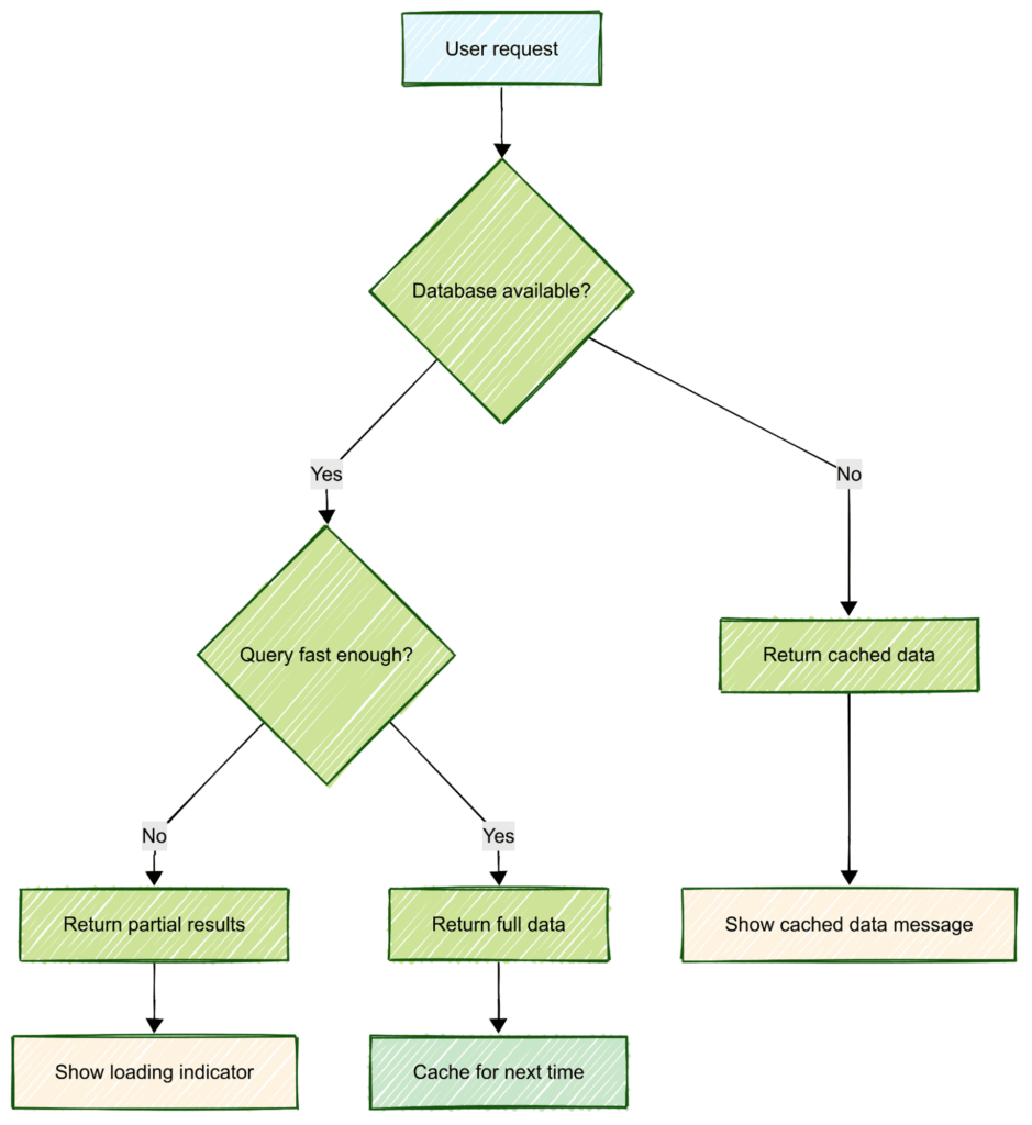
3. Database Planning Checklist
Before you touch any schema – THINK AND DIAGRAM:
Data Relationship Planning (5 minutes that save 5 hours)
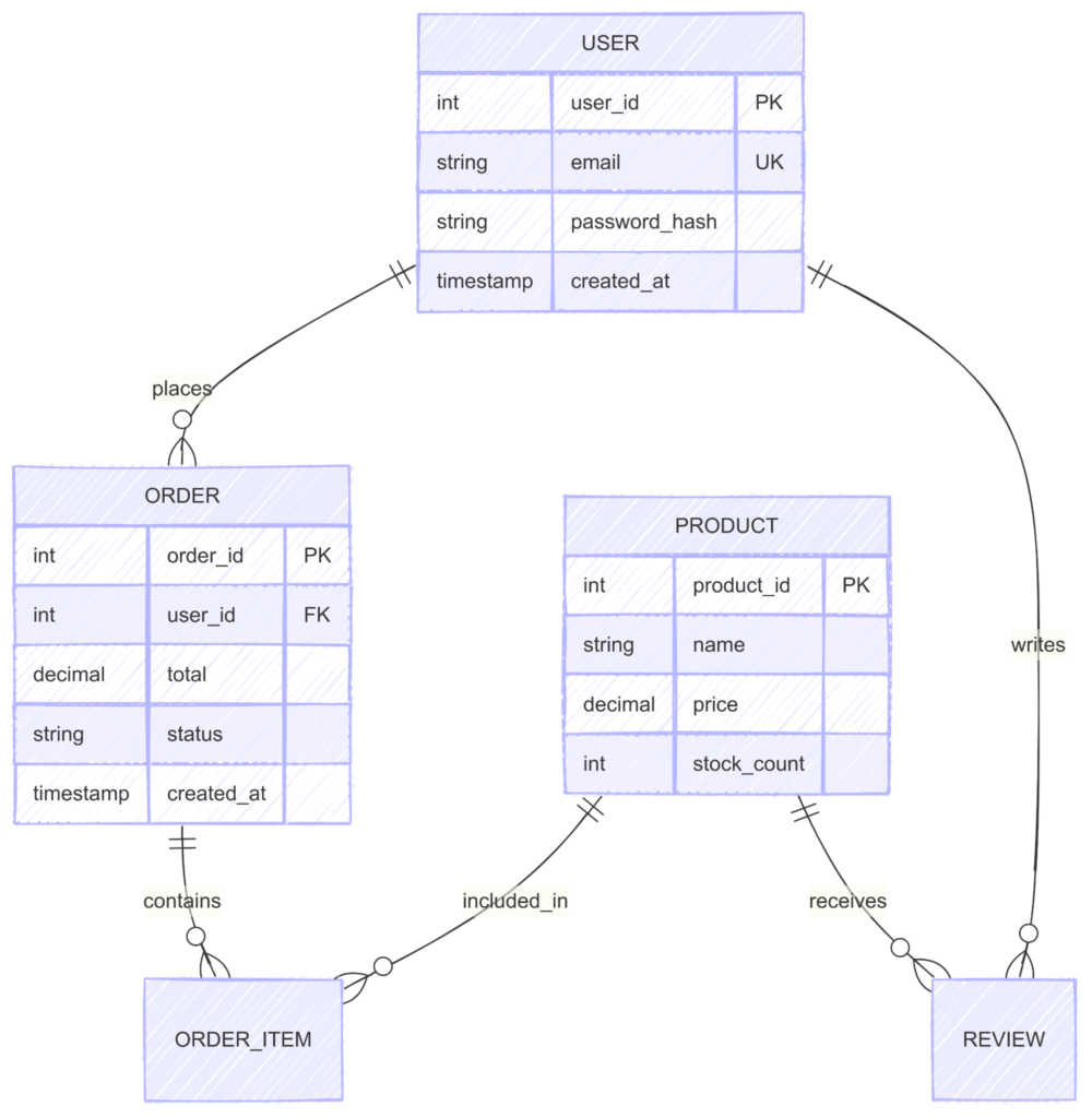
- What are the main “things” in my system? → List entities
- How do these things connect? → Draw relationships
- What will I query most often? → Plan indexes
- What happens when I delete something? → Map cascade effects
Planning Technique: Always start with an entity relationship diagram
4. Emergency Planning Checklist
When you have zero time to plan properly (but still MUST think):
The 5-Minute Sanity Saver
- Write down the happy path (2 minutes) → One sentence per step
- Think of one thing that could go wrong (1 minute) → The most likely failure
- Plan how to handle that one thing (2 minutes) → Error message + recovery
- Start coding (but keep a notepad open for more planning)
Emergency Planning Template:
The Planning ROI Calculator
Advanced Planning Techniques for Complex Features
1. The “Diagram First” Rule
For any feature taking more than 2 hours:
- Start with a flowchart (5 minutes) → Shows the user journey
- Add a state diagram (3 minutes) → Shows all possible states
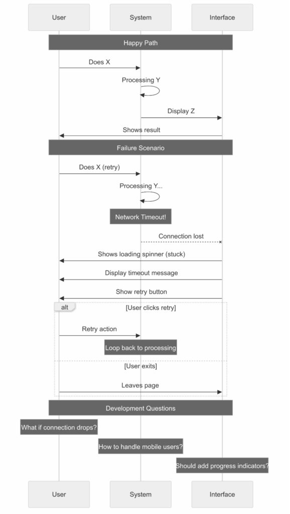
- Create a sequence diagram (5 minutes) → Shows system interactions
- Draw component/service breakdown (5 minutes) → Shows code organization
2. The “What-If” Brainstorm
Spend 3 minutes asking:
- What if the user is on mobile?
- What if they have slow internet?
- What if they’re using a screen reader?
- What if the database is down?
- What if someone tries to hack this?
- What if we have 1000x more users tomorrow?
Each “what-if” becomes a planning item that prevents a future crisis.
3. The Planning Mindset Shift
From: “I don’t have time to plan”
To: “I don’t have time NOT to plan”
From: “Planning is boring”
To: “Debugging at 2 AM is boring”
From: “I’ll figure it out as I go”
To: “I’ll spend 5 minutes figuring it out before I go”
From: “Diagrams are for managers”
To: “Diagrams are for developers who want to ship working code”
Remember: Every minute spent planning is worth 10 minutes saved debugging. Every diagram drawn is a bug prevented. Every flow mapped is a user experience improved.
The best developers aren’t the fastest coders – they’re the best planners.
The Universal Truths
- Users will always do things you didn’t expect.
- The thing that can break, will break.
- If you don’t plan for mobile, mobile users will hate you.
- Error messages are more important than success messages.
- Loading states are not optional.
- Security is not something you add later.
- If you can’t explain it simply, it’s too complex.
Final Words
Remember: Planning isn’t about being perfect. It’s about being prepared for imperfection.
You don’t need a 50-page document. You need 5 minutes of honest thinking about what could go wrong.
The best plan is the one that gets you building something that works, instead of debugging something that doesn’t.
Start small. Plan just enough. Build something that works. Iterate.
Now stop reading and go plan something! Your future debugging self will thank you.